5 Tips to Make Your Online Banner Ad Design More Attractive and Effective
Posted by richmediadp
Online banner ads have varied in their popularity over the years, but in spite of that erratic popularity, static online banner ads are still the workhorse of online web advertising. It’s a good idea to keep these general rules in mind when designing your banner ad or ads in order to gain effective results for your banner ad campaign.
1) Choose colors for your banner ad that get attention and will contrast to the background color of your website or landing page.
Keep the design simple. Make sure that you use relevant pictures associated with your small business. Many small business owners often make the mistake of emphasizing their logo instead of using pictures that immediately associate their banner ad with their business. For example, if you are a coffee shop owner, include a picture of your fantastic coffee drink with your offer. If you are a realtor, include a picture of a house and a small picture of yourself, something that will immediately associate your ad with the type of business you are in. As a general rule, only large well known companies such as Coca-Cola, Kellogg, Ford and other Fortune 500 companies who have spent enormous amounts of money in branding ad campaigns can afford to include solely their logos into their banner ads. It doesn’t mean you shouldn’t include it, it should not be the only graphic element.
2) Stick to brief, concise content for your banner ads.
Think snack sized content and make sure you provide a strong call-to-action (CTA). Try to emphasize one benefit and one call-to-action per banner ad. If you include too many call- to-actions then you stand a greater chance of confusing your prospective lead and your click-thru rate will suffer. This rule of thumb especially applies to static online banner ads. Remember, the effectiveness of your click-thru rate will rely on the message that you are conveying.
As a graphic designer it pains me to write this, but attractive graphic design is secondary to professional copy writing and a compelling call-to-action. Sometimes even ugly banner ads with compelling messages can perform better than beautifully designed banner ads. Ultimately, what is important is the design attracting the intended or target audience.
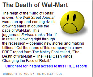
The following is an example, of what I would call an “ugly banner ad” because it breaks most design rules. However, I can suspect based on the placement of the following ad, (major newspaper websites) that great thought and demographic testing has gone into why this ad is effective for it’s advertisers. In my opinion, this ad was designed purposefully that way, it wasn’t the the work of a lousy graphic designer.
It’s a perfect example, of the exception that breaks the rule. But for most small business marketers, it’s better to consider your graphic design carefully and your target audience. While the graphic design may attract their attention, it’s the strong message that is communicated that will improve your banner ad’s effectiveness. However, if you have great graphic design as well as a compelling message the two combine to improve your ad’s effectiveness and click-through-rate.
3) Use legible fonts…
…especially on smaller banner ad sizes since the area of a banner ad is small you will want to make sure that you use legible text. Verdana and Arial are very popular fonts for the web because they are easy to read. Stay away from script fonts for your call-to-action unless you are designing a larger banner ad or it is part of your logo. Keep in mind you want your prospective lead to read your message and ideally act on it. Don’t make this process difficult by using hard to read fonts.
4) Provide interactivity to improve customer interaction and click-thru rate.
If your advertising budget allows, have your banner ad designed to ask your prospective lead to fill out a survey, answer a question, or participate in a poll. Studies have shown that some type of interaction in your banner ads will improve click-thru rate. There are simple interactive ads that you can have designed and there are interactive ads that are more complex that include surveys, video, etc. However, keep the interaction relevant to its purpose.
5) Try not to include animation for animation’s sake.
The novelty of dancing monkeys, twirling circles, shooting stars, etc. without any tie-in to your ad has disappeared. As a general rule, this type of animation often turns off your prospective customer rather than motivate him or her to click-thru your ad. While some of these animations were barely tolerable in the wild, pre-Web 2.0 early days of the internet, with so many well designed banner ads on the web competing for an internet user’s attention, they can look dated and cheap now. This gratuitous type of design in your banner ad will only diminish its click-thru rate and will ruin the overall appeal or message you are trying to make.
These are just a few tips to get you started with your banner ad campaign, if you’d like to know which banner ad size performs the best, you might want to read the blog post “Best Ad Size” to see which banner ad size is the top performer. Clue: It’s square.
Furthermore, I’ve included a video that covers some of the actual design principles discussed in this article for three of the most popular banner ad sizes plus further tips and principles to keep in mind when designing your online banner ads. The business used in this video is a fictitious bakery business but it serves as an example of best practices for banner ad design that is applicable for small business marketing. I hope you find it informative and “Like” my article or leave a comment, if you find it helpful.
Photo Credit: Cupcake designed by Lazy Crazy
=-=-=-=-=-=-=-=-=-=-=-=-
Related Post:
About richmediadp
I'm a freelance graphic designer working out of Orange County, CA - USA. I work with small and mid sized companies to develop creative solutions for their design problems from print collateral to online graphics.Posted on September 2, 2011, in Banner Ads, Video Tutorials, Web Design and tagged Adobe Photoshop CS5, animation, color palette, fonts, graphic design, online banner ads, small business marketing, static banner ads, web design. Bookmark the permalink. 4 Comments.


Good article! It\’s nice to read information from someone that knows what they are talking about.
Good article…one comment on the “good” ad example used in #2. The text at the bottom is extremely difficult to read with the pattern in the background. Text being readable is also important. The ad itself is very visually appealing, just difficult to read.
Thanks, this was helpful.
Great article ! Thanks !